Introduction
The shift to mobile devices as the primary means of internet access has prompted search engines, particularly Google, to prioritize mobile-friendly websites. In response, Google introduced mobile-first indexing, a significant change in the way websites are crawled and ranked. To maintain or improve your website’s search engine rankings and visibility, it’s essential to prepare your website for mobile-first indexing. In this article, we’ll explore what mobile-first indexing means, why it’s crucial, and the steps you can take to ensure your website is well-prepared.
Understanding Mobile-First Indexing
Traditionally, Google’s indexing and ranking systems used the desktop version of a website’s content to determine its relevance and position in search results. However, as mobile usage continued to surge, Google recognized the need to adapt.
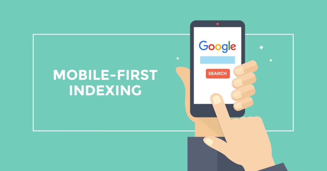
Mobile-first indexing means that Google primarily uses the mobile version of a website for indexing and ranking. This means that when Googlebot crawls and analyzes your site, it starts with the mobile version, even if someone is searching on a desktop. Google’s shift to mobile-first indexing reflects its commitment to providing users with the best experience on mobile devices, which now dominate internet traffic.
Why Mobile-First Indexing Matters
- User Experience: Mobile users expect fast-loading, responsive websites that provide a seamless experience. Mobile-first indexing aligns with Google’s focus on delivering user-friendly search results.
- SEO Rankings: Websites that aren’t mobile-friendly risk seeing a drop in search engine rankings. Mobile optimization is a ranking factor in Google’s algorithms.
- Mobile Search Dominance: A significant portion of internet searches happens on mobile devices. If your site isn’t optimized for mobile, you could be missing out on a substantial audience.
Steps to Prepare Your Website for Mobile-First Indexing
- Responsive Web Design:Implement a responsive web design that adapts seamlessly to various screen sizes and devices. Ensure that your website functions well on both small and large screens.
- Mobile-Friendly Content:Make sure your content is easily readable on mobile devices. Use legible fonts, appropriate text sizes, and avoid pop-ups that obstruct content.
- Optimize Images and Media:Compress images and use formats suitable for mobile loading speeds. Optimize videos and other media for mobile consumption.
- Page Speed:Prioritize fast-loading pages. Use tools like Google PageSpeed Insights to identify and address speed issues.
- Mobile SEO Best Practices:Implement proper mobile SEO techniques, such as using mobile-friendly meta tags, structured data, and optimizing for local mobile search if relevant.
- Test Mobile Usability:Utilize Google’s Mobile-Friendly Test to assess how Googlebot views your mobile site and identify potential issues.
- Structured Data:Ensure that structured data markup (schema.org) is present and accurate on both desktop and mobile versions of your site.
- Monitor Google Search Console:Regularly check Google Search Console for mobile usability issues and follow any recommendations provided.
- User Testing:Conduct usability tests with real users on mobile devices to identify any issues that might affect user experience.
- Update Your Content Strategy:Consider how mobile users engage with content and adapt your content strategy accordingly. Prioritize concise, scannable, and easily digestible content.
Conclusion
Mobile-first indexing is a fundamental shift in how Google evaluates and ranks websites. To maintain or improve your website’s search engine rankings and ensure a positive user experience, it’s crucial to prioritize mobile optimization. By following the steps outlined in this article and staying attentive to mobile usability and SEO best practices, you can prepare your website for the mobile-first indexing era and continue to thrive in the ever-evolving digital landscape.
